Exorcised Apparel


Exorcised Apparel: a fitness clothing line which aimed to be the anti-Lululemon. This brand catered to those who lived a fit lifestyle, without the cookie cutter fitness stereotype.
With tops, leggings, sweaters and accessories that quoted iconic punk rock bands like The Cramps and featured East Los Angeles slang, you knew you were getting into something off the beaten path.
With Exorcised Apparel, you aren't making a statement- you are the statement.
Baseline Analysis

Some Competition
When thinking about the type of user experience Exorcised apparel needed for their customers, we first knew we had to see who else we were dealing with in the space.
Our team conducted competitive analysis’ and user research around exactly what type of customer we were working with and what their shopping habits would be like while thinking about our competitors in such a niche market.

Knowing we would be working within the Shopify platform, our team broke down Exorcised’s target market to four key shoppers. This helped our team understand the brand buildout and user experience within the web store.

Building the Business
Understanding their core shoppers was one of the most important aspects in creating Exorcised Apparel’s Brand.
Because of this qualitative insight, we were able to play with explorations of where to take the look and feel both from a visual and user interface perspective.
We took the information from these findings and created the the foundation of their web store.

Concept Explorations

Webstore Launch
With UX methods such as user interviews and card sorting, we began to build the site architecture and structure of the Exorcised Apparel’s web store for overall fun and ease of shopping.

Homepage
Stark contrasts between the black header and the white background give attention where it needs to be: the product.
We purposefully built this homepage to feature product right from the forefront, while offering imagery that is inline with Exorcised Apparel’s aesthetic.

Category Page
Stark contrasts between the black header and the white background give attention where it needs to be: the product.
Easy filtering and sorting lets the user search for whatever product they may be searching for.
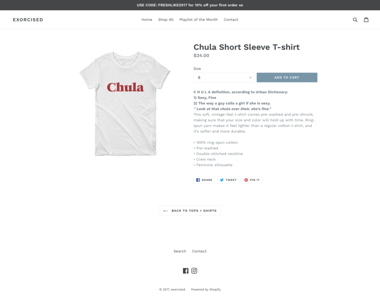
Product Page
Stark contrasts between the black header and the white background give attention where it needs to be: the product.
We purposefully built each product page to contain only the necessary content needed for user purchase.


Mobile
We strived to build a mobile shopping experience that was easy, quick to use while offering the user minimum friction points.

Post Launch
Over the course of a year Exorcised Apparel generated sales, gained a multitude of followers, and began to form itself into a true fitness brand:
12k+ weekly page post frequency
13k+ weekly page reach
3k+ Followers